App types: creating views or bar charts

Hi, this is a silly-rookie question:

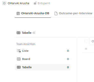
I noticed that some database Apps have “empty” icons and some Apps have icons filled with lines.
When I add a new App, I get only Apps with an icon without lines. What is the difference between the two? Can I somehow transform one into the other?

I noticed that in Apps with “empty” icons I cannot create views or bar charts for categories (i.e. #records per country).

So I guess this is most likely some basic database issue which I should know - but unfortunately I don’t.
Where would I find information on this? How do I create an App where I can create views by specific categories (not only date) or respective bar charts in a dashboard?

Thanks so much,
Konny

1 Like

@Konny - I hope this might help…
I saw your question and wanted to share a quick screen recording with clarification that might help. What can look like an “empty” icon is usually just a default app icon, or an icon that was never customized when the app was created. You can rename the app and update the icon later, including the color and icon type.

It also sounds like you may have created a dashboard app, which is why you’re seeing the graph-style icon and not the options you’d expect for views or filters. Those features are available in a regular database-type app, while bar charts live in dashboard apps. If you want, you can create a few different app types and delete the ones you don’t end up using.

See this short video with examples
https://www.loom.com/share/aa03697850cf421c86a62ad61b760a70

1 Like

Hi @CarsonRedCliffLabs ,

Thank you very much for your speedy reply, greatly appreciated!
I may not have been very specific. The App itself is actually not “empty” - there is data in there.
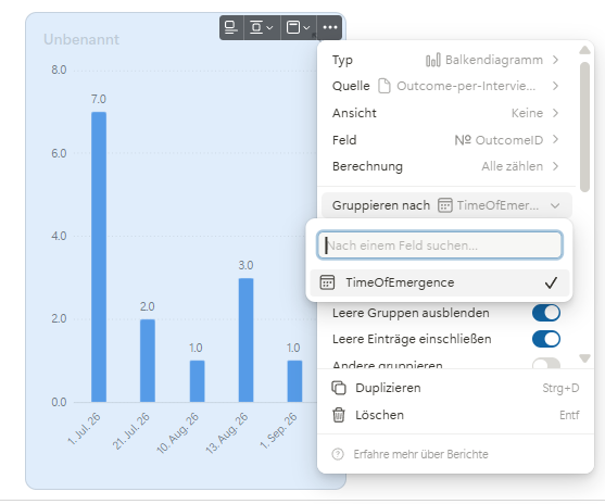
And yes, I did also create a Dashboard App. In this App I can create a bar chart from data in one type of App (see image 1 below)

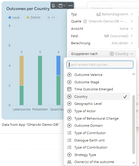
But when I try to do this for the data from the other App, I cannot select “country” or any other datafield / category - only the datafield with the “time of emergence” of the outcomes is shown (see image below)

image

I am sure I am missing something - I need to prepare the database or do something to the datafields - but I don’t see where.

Frustrating. - automatic interview upload and my automations to extract outcomes from interviews via an AI from one App and writing the results into another APP, plus tagging the data, all worked like a charm (ok, with a lot of support from Claude :wink: - but I now fail to visualise the results because I (and Claude) don’t know our way around Tape! So glad there is a community to ask (who needs AI : )))

Cheers,
Konny

2 Likes

Hi @Konny,

Thanks so much for your questions and the detailed screenshots! And thank you, @CarsonRedCliffLabs, for jumping in with the explanation and video. No silly questions here :100:

On your first question about the icons:

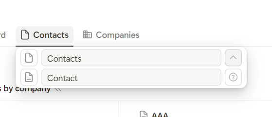
As Carson explained, these are default icons. To clarify the difference: the empty page is the default icon for a database app, while the page with lines is the default icon for a record. They’re shown until you choose your own icons. The icons themselves don’t affect what you can do with the app or its data.
image

You can choose different icons for the app itself and its records. When you set an app icon, we also apply it to the records by default, but you can change them separately.

On your second question about grouping:

Your screenshots give us a good clue! In your first app, Country appears to be a select field, which makes it available for grouping. In Outcome per Interview, only the date field appears in the grouping options. This suggests that Country either isn’t available in that app or uses a field type that isn’t supported for grouping.

Reports currently support grouping by single-select, multi-select, status, date, relation and member fields. A country name stored in a text field, for example, won’t appear in the grouping options.

The important point is that the field you group by needs to be available in the app selected as the report’s source. The report counts records from that app, so it also needs the grouping information for those records. It cannot automatically use a Country field from another app, where the records and their counts may be different.

To use that country information in your Outcome per Interview report, you could add a Country select field to that app and use an automation to keep it in sync with the corresponding information in your other app.

However, if Country already exists as a select field in Outcome per Interview and still doesn’t appear, that could indeed be a bug. Reports have been out of beta for a while and are used by many teams, but of course, unexpected issues can still happen. In that case, please share screenshots of the fields in that app, especially the Country field and its field type, and we’ll take a closer look together.

I hope this helps make things a little clearer! And your automation setup sounds really cool, let’s get the reporting part working for you too.

All the best,
Leo
1 Like

Hi @Leonard_Young,
Again - tx a million for your speedy reply! Phantastic - you solved it.

To clarify: I was talking about the icons of the Apps - and I’m glad to hear that the “empty” ones also refer to a database app : - )
image

AND: no, this is not a bug - unless you count the one in my brain, too!

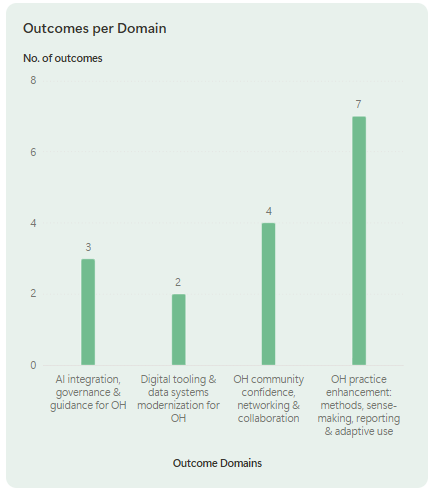
I get the “categories” for the datafield “AI-OutcomeDomain” (or “Country” etc… …) from a call to the Landock LLM and they are currently written into a single line text field. It is totally logical that I can only create a chart from datafields that are “selcet” fields with a dropdown, i.e. define the categories! Once I created a respective datafield by hand reflecting the categories created by the AI I could do the chart:

image

Yepeah yea! BUT - This creates the next challenge: can I create such categories automatically based on the output created by an AI? I.e. can I write AI output directly into a single-select datafield (without predefined categories) - or take the text from a single-line text in one datafield (the AI-output) and write it as a drop-down “category” in another datafield? Is there any way to automate this? The problem is, that I want the AI to be free to discover new categories, hence I cannot predetermine the categories.

Again, thanks so much for your help!
Cheers, Konny

1 Like

Hi @Konny,

Really glad to hear the icons and reporting setup make sense now! :100:

I also took a quick look at your next use case, and yes, this is actually possible.

You can already create and manage select field options through our API, and we recently released our MCP Server as well:

Through the MCP Server, your AI can create new category options dynamically. So you would basically just need to follow the setup guide, connect the MCP Server to your AI, and then let it create new select options whenever it discovers a new category.

If you have any further questions while setting this up, just let me know.

All the best,
Leo

3 Likes

Hi Leo, Thanks a million!
So good to know - I will test soonest.
All the best, Konny

1 Like