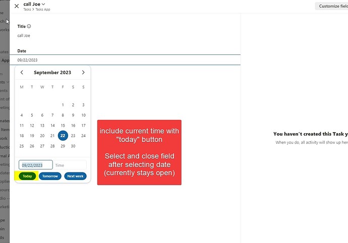
Selecting a Member, Status, and Dropdown field closes on selection. I think it would be beneficial for the calendar to respond the same way when selecting a predefined option (eg today/tomorrow)
I would also like to suggest having the current time included when mandatory. Or at least the ability to push [DOWN ARROW] on the keyboard to default to the current time like other programs.
These small tweaks will allow users to navigate quicker when entering data.
Thanks for your consideration ![]()
