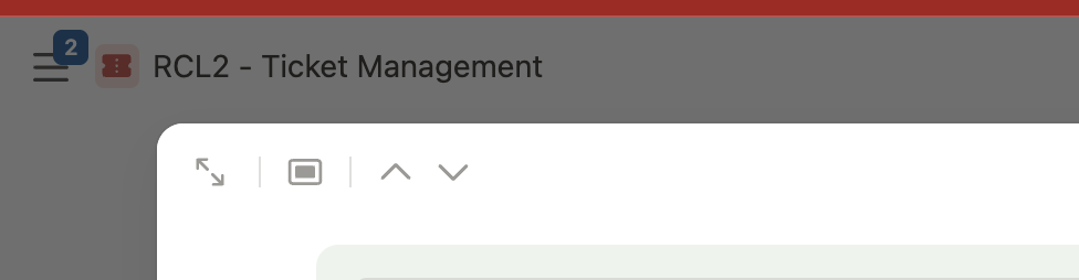
Slightly different, but related to this improved navigation request - We wish that Tab Labels would dynamically change/reference which record is open within that tab. (video link above touches on this as well)
Thank you very much for pointing this out. We already have it on our list, and we have actually run into the same situation ourselves and discussed whether the breadcrumb should always be shown.
Initially, we thought the interface would feel cleaner without it when opening a Record directly from a View, since the relevant context is already visible in the background. We generally try to avoid displaying too much information and making the Record feel overloaded. However, we completely understand that the breadcrumb is very helpful for quick navigation.
Once we have completed the remaining field types and are preparing to move the new Record experience out of beta, this is one of the items we already have on our list to review and improve.