Hi @CarsonRedCliffLabs and @1F2Ns,
thank you both very much for the additional feedback 
First of all, @CarsonRedCliffLabs, just to confirm: the sorting bug itself is now fixed on your side as well, right? That was the most important part for us, because that was a real bug.
Regarding the color assignment topic, I can understand both of your points very well. There are basically two camps here. In the early days of Tape, we actually had one default color for category options, similar to how Podio handles it. Back then, we received feedback that the default color should be different, because some users preferred a darker gray, while others wanted something like blue. We also received feedback that using only one default color made it less obvious that more colors were available. So it is a trade-off and depends a lot on the use case.
That is why we decided to combine automatic color assignment with bulk changes. It is not really possible to bulk-assign a different color to each category option. For example, if you import 100 category options from Excel, you would otherwise have to color each of them individually. That is why we currently assign colors automatically first.
At the same time, you can change even 200 category options to one preferred color with just 2 clicks using the bulk selection. And you are not limited to one predefined default. Some users may prefer light gray, others dark gray, and others blue. In our opinion, this is the most powerful and flexible approach, even though it required more effort on our side to implement.
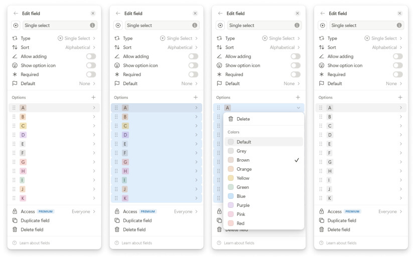
When the mouse is inside the options section, users can use Ctrl + A to select all options and change the color for all of them at once. Users can also use Shift + Click to select multiple specific options and update only those in one step.
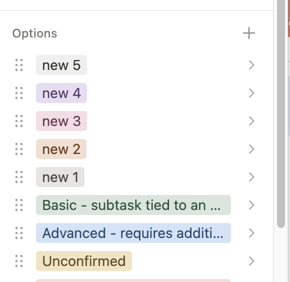
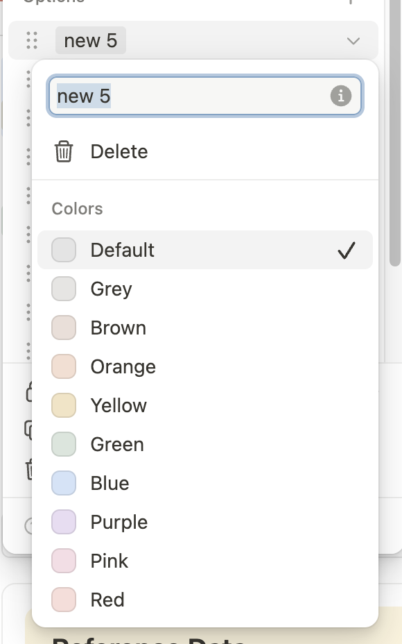
I am attaching the screenshots to show how this works.
However, we probably need to make this workflow more discoverable. We want to provide a shortcut overview in the mid term, and we should also consider adding this shortcut to the tooltip near the drag indicator.
Thanks again to both of you for the thoughtful feedback. Really appreciated.
Best,
Leo