In this thread, we can capture little things that we notice in our daily work with tape and want to share with the team.
Why is the title shown twice in the detail view? Wouldn’t it be much more space-saving if only the top title was displayed?

![]()
What is the function of this button? Where can I read about it?
Wouldn’t it be more logical if the button displays the current status? e.g. 🔒 Locked / 🔓 Unlocked?
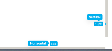
The horizontal and vertical scrollbars have not the same thickness. ![]()
![]()

Hi @Roman,
thank you very much for your detailed feedback, all your points are very valuable! I’ll have to look directly at the scrollbar to see if this is a rendering issue or if a wrong value has been set.
Collapsing and displaying the comment column is actually already planned for the upgrade of the record frame on the roadmap.
The title is another point we want to optimise. Currently, the title of the record is always the first field. For some use cases it is better that the first field is not the title, so we need to rethink this in general.
I can fully understand that you are confused by the unlocked or re-unlocked status of an app. Sorry for that! The feature is currently under development and serves as the basis for the dashboards, but will also greatly improve and simplify editing the fields of record layouts etc. in the future. It will behave exactly as you suggest. The menu options are currently still hidden, but we haven’t considered the logic that when an app is created it is set to unlocked, so you have already seen the unfinished feature.
As soon as we release it, we will explain the functionality in detail.
Cheers
Leo
Why are these two UI elements fuzzed out? Is this a rendering problem from the browser?

Other elements are razor sharp.

Hey @Roman,
Neat idea!
In an effort to keep things easier for the Tape team to find/archive it may be a good practice to create new posts for different topics.bugs.
Especially for new feature requests.
Posts in the feature request category have the ability to be voted on [+1]
Requests with the more votes get implemented faster than others.
You can see and vote on feature requests and create a new request for dynamic favicons here:
Thank you for your feedback, makes sense. ![]()