If you guys are still working on forms, we do hear pretty regular requests to change
A) the wording of the submit button
B) the wording of the confirmation page that says “Thank you, your submission has been received”
or
C) to add a redirect on the confirmation page.
All nice to have little things, but not mission critical, just somewhat related to taking away this little branding piece, so I was thinking of it.
thanks a lot for this really valuable feedback, much appreciated!
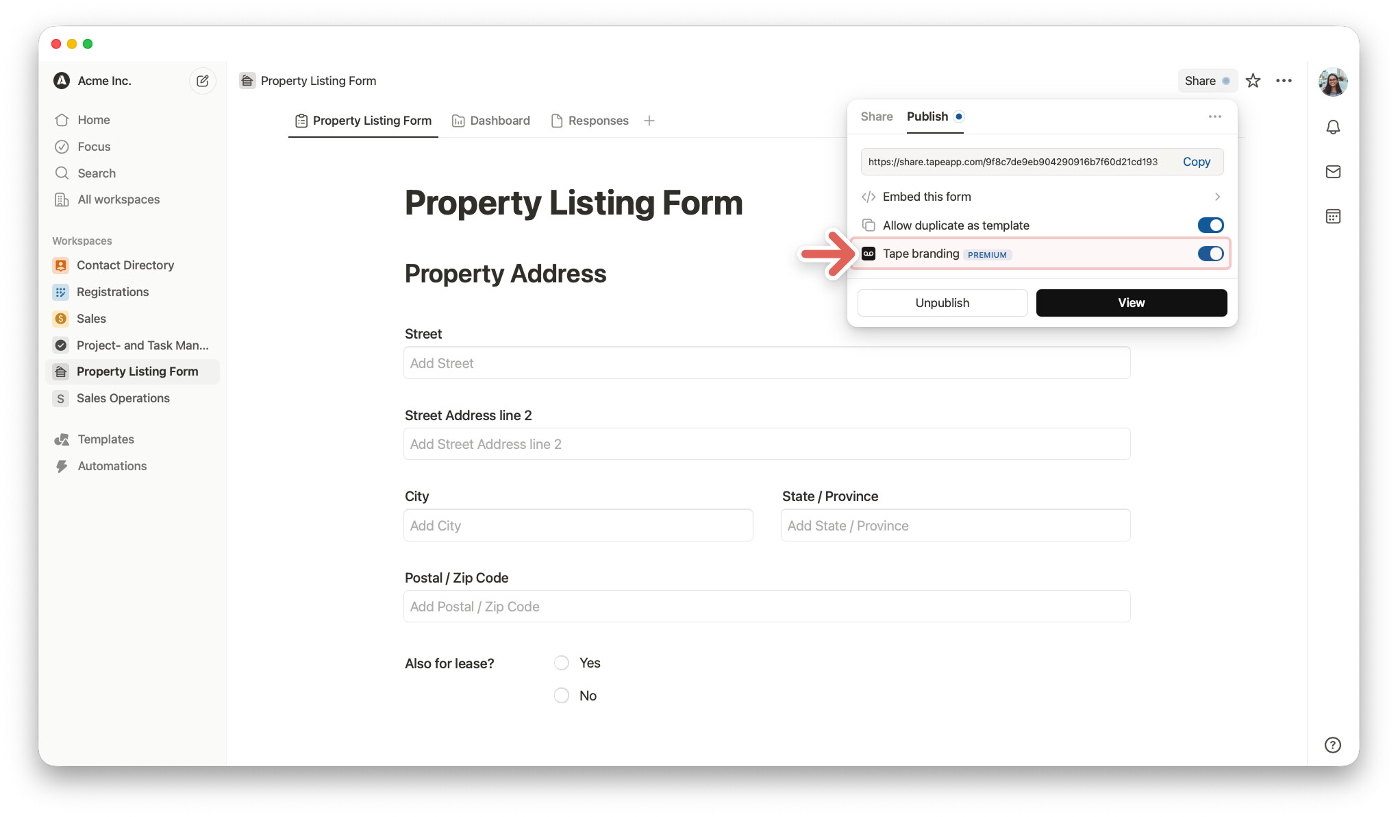
Right now, our main focus is on the new Record. As part of that, we also adjusted the branding because we reworked the height calculation for shared records and forms. On some devices, the content wasn’t perfectly centered, and since the branding is part of that calculation, we addressed it along the way.
The submit button wording definitely feels like a low-hanging and something we can pick up fairly easily. For the confirmation page wording and redirects, it’s a bit more involved: we’re planning to solve this through Pages, which will allow dynamically defining confirmation pages and redirects based on user input.
Because of that, it’s unfortunately not a straightforward quick fix. If we implement it in isolation now, it wouldn’t integrate well with the upcoming Pages logic and migrations. So we’d prefer to tackle this properly as part of that rollout.
Really appreciate you bringing this up, it’s super helpful input for us.