We enjoy sharing a look behind the scenes with you.
You might have noticed some changes to the design and overall feel of the charts. This facelift is all about making your experience smoother, more intuitive, and visually appealing. While the core features you love remain the same, we’ve refreshed the interface to enhance usability and include some of your feedback.
Here’s what you can expect:
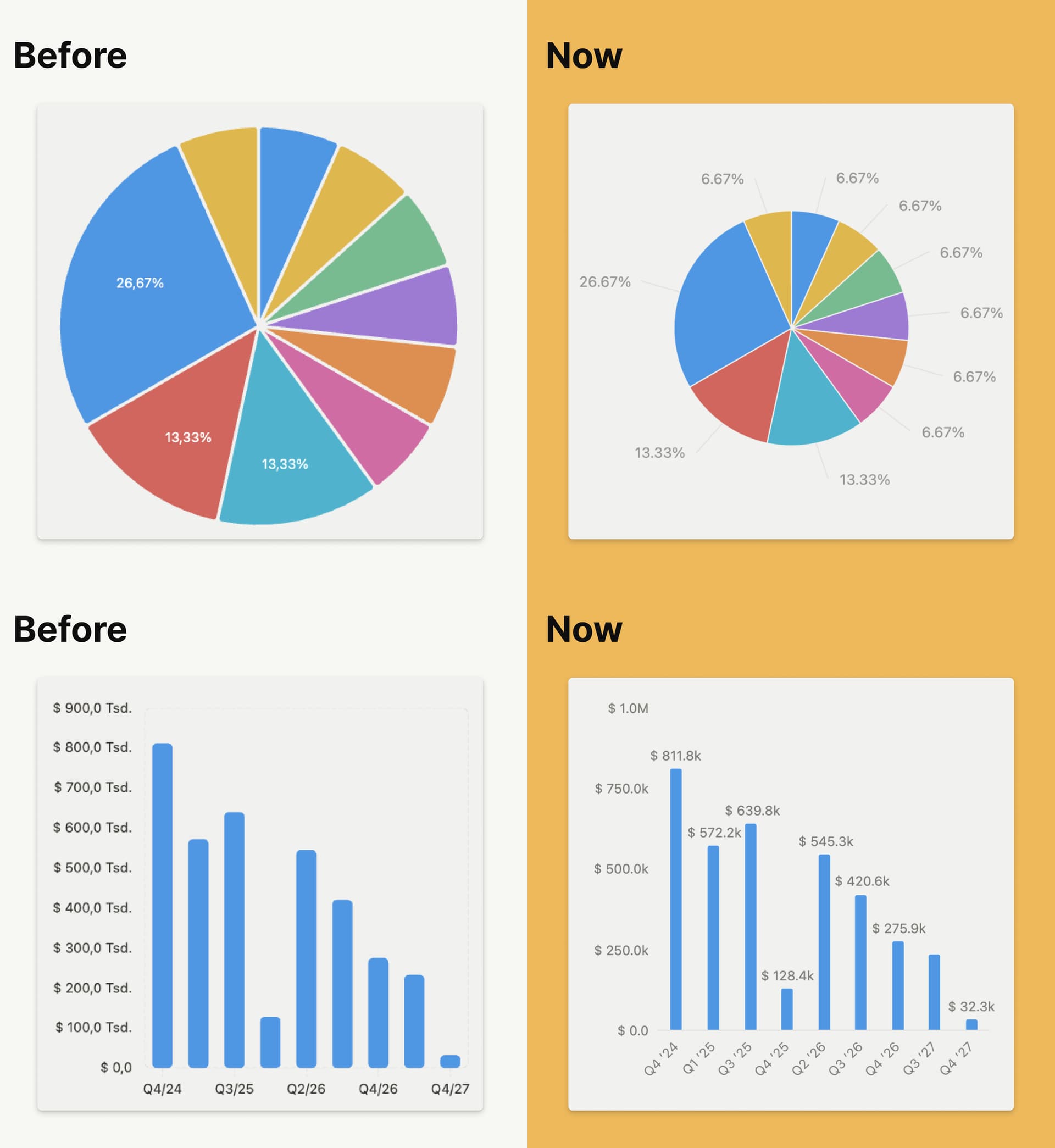
- More features, increased technical demands: we’ve addressed some (bad) blur issues. For example, in the image above, just zoom in, and you will notice the blurriness on the charts before, especially in the pie chart numbers and lines. We’ve improved the technical foundation, and now charts are provided as SVGs for better clarity.
- Better visibility: we’ve optimized labels. In the example above, the pie charts before only displayed values for the top 3 categories — now, all labels are displayed.
- Updated design: we’ve made a number of design tweaks, such as setting a maximum width for bars to create a more uniform look, improving tooltips on hover, and many more.
The facelift of the charts comes straight from the heart. Our goal was to make Tape not just a powerful tool, but also a joy to use. We hope you enjoy the facelift as much as we do. Thank you for being a valued part of our amazing community!