data is everything. I believe that a revamped dashboard would allow us to better visualize and understand our client’s data. This would give us a more accurate and up-to-date snapshot of where the business is at, which would help us make better decisions.
Data visualizations of the information in our different apps. This would make it easier to see trends and patterns in our data.
The ability to filter and drill down into the data. This would allow us to get more granular insights into our data.
thanks for the feature request! Dashboards are currently one of the top priorities on our roadmap and have already been mentioned to us by several partners and users.
We will have a dedicated app type dashboard, so you can build and use dashboards as you like e.g. as a home page for a workspace or as a management overview in an extra workspace.
I would also be very interested in a mockup or screenshot so I can check that we meet all your requirements.
Excited to hear about the incoming dashboards. I’d love for them to basically be calculation fields on steroids with the flexibility to pull data from anywhere and display it using the existing HTML/Javascript tools. An example use case:
(1) An HR workspace that includes an app for Personnel records and an app for Leave Request records. Personnel records would have some unique identifier such as a relationship field to a user/guest or a field containing the user’s/guest’s email address. The Leave Request app would have a relationship field to the Personnel record.
(2) A travel workspace with an app for Trips/Events, an app for Attendees, and an app for Reimbursements. Attendees would have a unique relationship field to Personnel and a unique relationship field to Trips/Events. Reimbursements would relate back to an Attendee record.
(3) Finally, a theoretical “You” workspace dedicated to displaying/summarizing the data unique to the logged-in user via “dashboards”. One dashboard app could find a record in the Personnel app that ties to the logged-in user, grab all related items from the Leave app, and show both individualized summaries (e.g. 70 hours of annual leave available, total 270 hours of annual leave accrued, total 170 hours of annual leave used, total 30 hours of annual leave planned) and a detail table (all leave requests in a table showing date, type, approval status, and # of hours). Another dashboard app could do something similar with Trips/Events and Reimbursements–a detail table of all trips/events that the logged-in user was involved in via Personnel–>Attendees including the status and amounts of any of their Reimbursement records tied to that Trip/Event, and summaries that show total $$$ reimbursed, total $$$ pending reimbursements. etc.
great to meet you and a warm welcome to our community!
All your use cases for dashboards make 100% sense and are extremely valuable for us in the requirements analysis of how we implement the dashboards in detail.
I can already confirm that our ideas and considerations go very much in the direction you would like to see. After we have the basic canvas with the drag and drop grid and all the basiccs so far, we want to create a code block as one of the first dashboard blocks in which the users can generate very powerful reports with JavaScript.
With conditional display of blocks or an active user variable, which we are planning in a further step, we could then implement the “You” dashboard. However, this would also be possible with the current permission system with several dashboard apps in which only the respective user has access.
If you have more ideas or use cases then please write us here anytime. The more real use cases we have from our users the better the feature will be in the end!
Hi there!
Excited to hear about the dashboard feature coming, too! We are also interested in this for our ticket system. To give you an example:
(1) I have workspaces I share with all customers and a Ticket app
(2) Automatization copies the Ticket in an internal pool system where I can assign a team, team member ect.
(3) To manage the tickets, the tables are totally enough, but to give me a total overview of # of incoming tickets per week, # of (still) open tickets per week etc. the dashboard would be useful
Same goes for avg. response time, avg. closing time etc.
great use case for tape and especially for the planned dashboards to make the overview of open tickets even better. We will also consider your use case directly during the implementation.
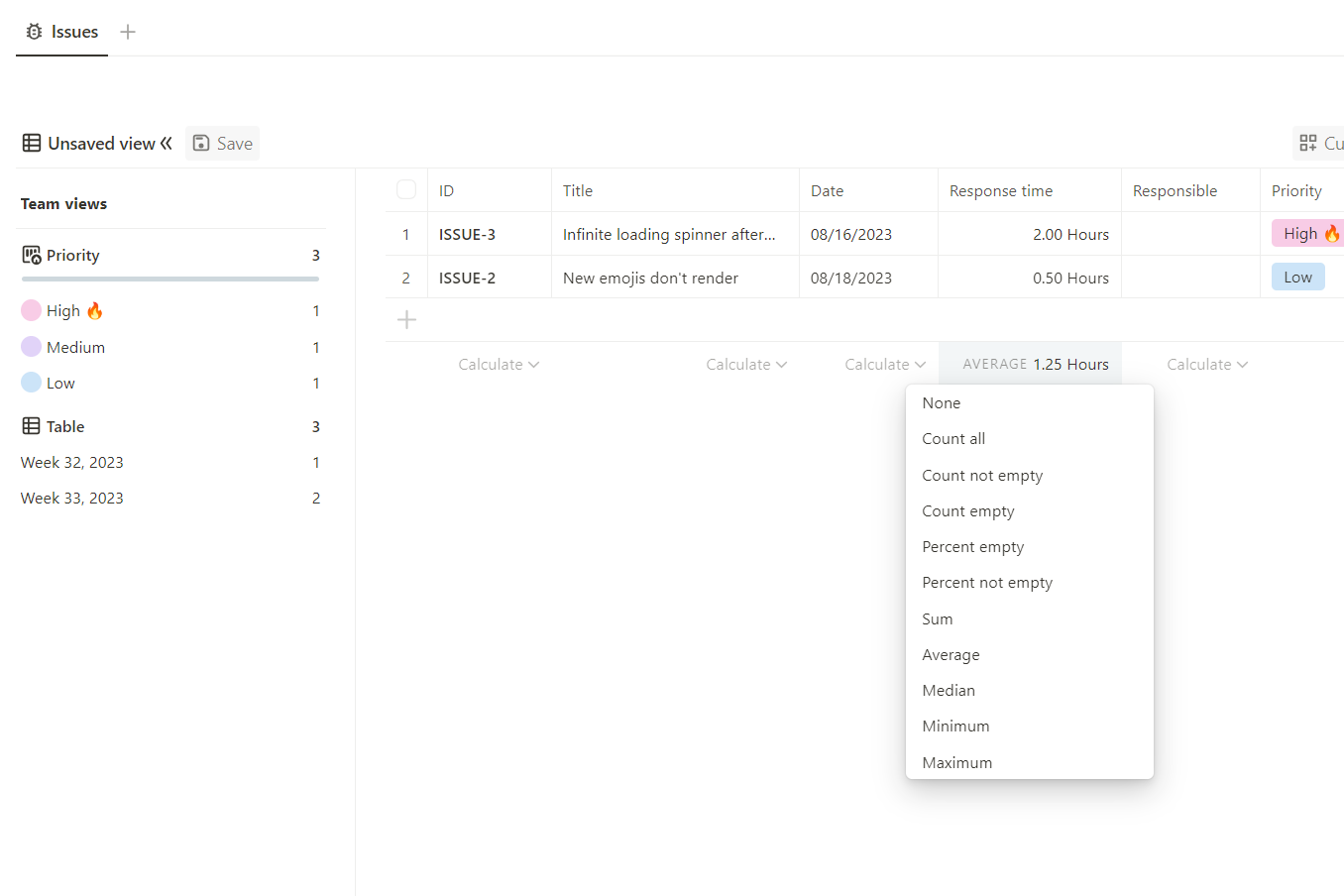
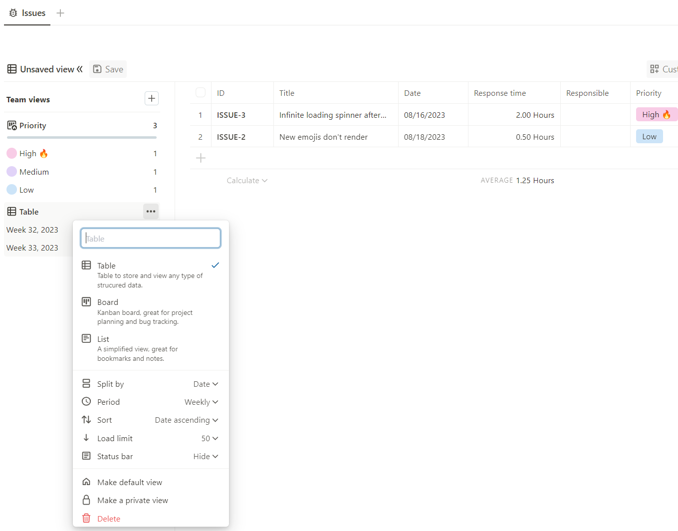
One more question, have you already tested the split by function in the views for a date field and calendar week for your use case? With this you could already get a very good overview with the filters. The average closing time you could evaluate with the table calculations over all tickets and automatically determine per ticket with the calculation field.
first of all a very warm welcome to the great Tape community. We are very happy that you are here!
The only way that currently works should be via an iframe in the calculation field if google allows that.
But that’s more of a workaround than the solution you’re probably looking for.
However, the dashboards have the highest priority in the development and as one of the first dashboard blocks we want to offer a script block with which exactly such an embed of google locker studio or others can be implemented.
now that we are making really good progress with the groundwork in the dashboards and are getting into the details, we would like to understand even better which tiles (widgets) people are currently using the most so that we can design and prioritize sub features in the best possible way to solve these use cases first.
It would be amazing for us if you could post screenshots of your dashboards, where of course no critical data should be recognizable. If this is difficult, it would be also great if you could just send them to me directly.
We have also created a list of the current feature set including known extensions and workarounds. It would be very helpful if you could also look through this and select what is currently most important for solving your use cases.
If something is missing or you have further insights, ideas or wishes, please feel free to post them or send them to me personally!
Many thanks in advance for this great support and best regards
Leo
Which tiles (widgets) are crucial for your use cases
Home
My Calendar
My Connections
My Favorite Apps
My Recent Items
0voters
General
Text
Image
Links
0voters
Workspace
Workspace Tasks
Workspace Calendar
Workspace Files
Workspace Contacts
0voters
App
App content edited past week
App content select view
0voters
Reports & Charts
Report with count
Report with calculate duration field
Report with calculate number field
Report with calculate money field
Report with calculate calculation field
Show report items per (split by / group by)
Chart type table
Chart type bar
Chart type line
0voters
Which extensions are crucial for your dashboard use cases
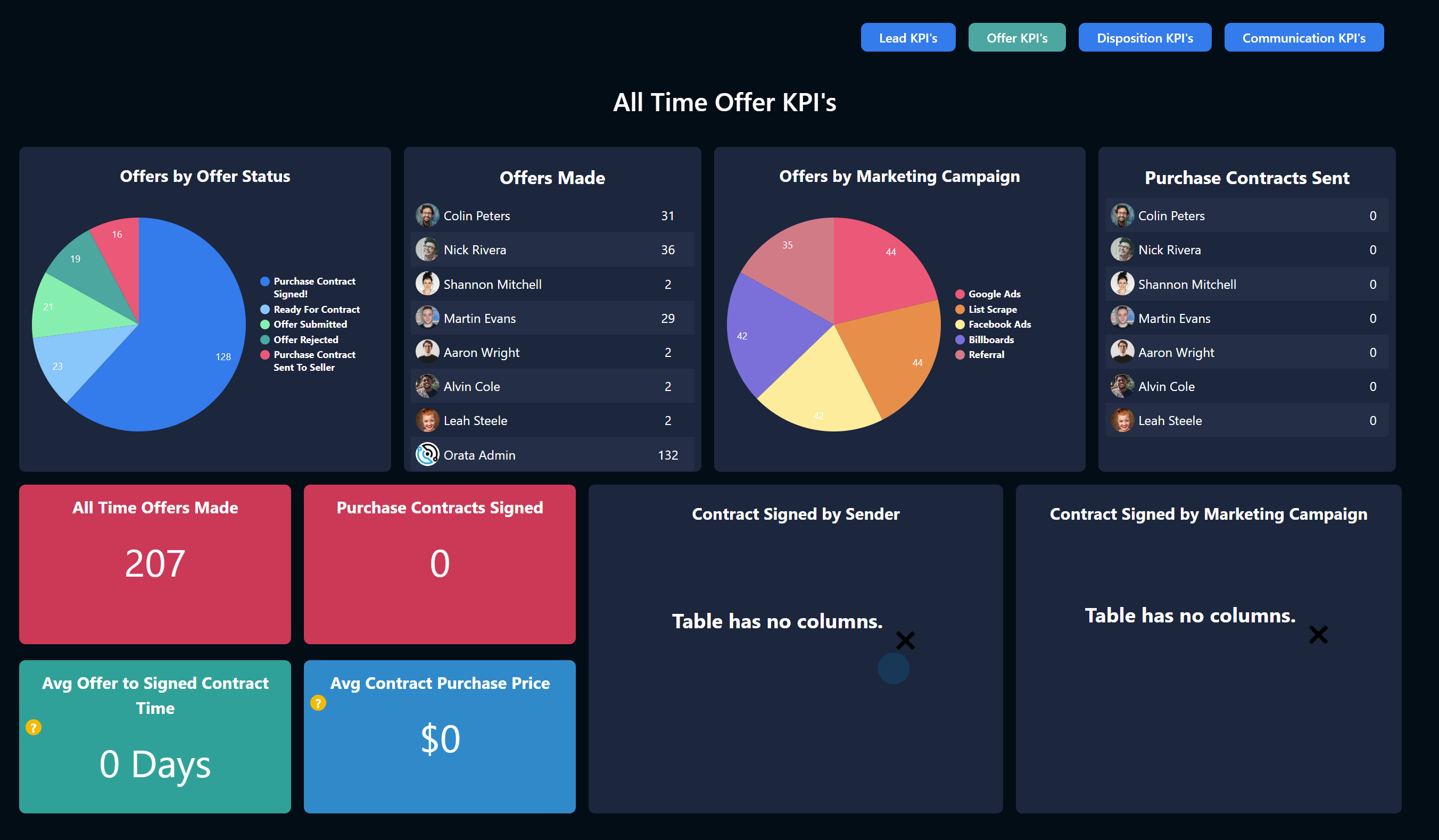
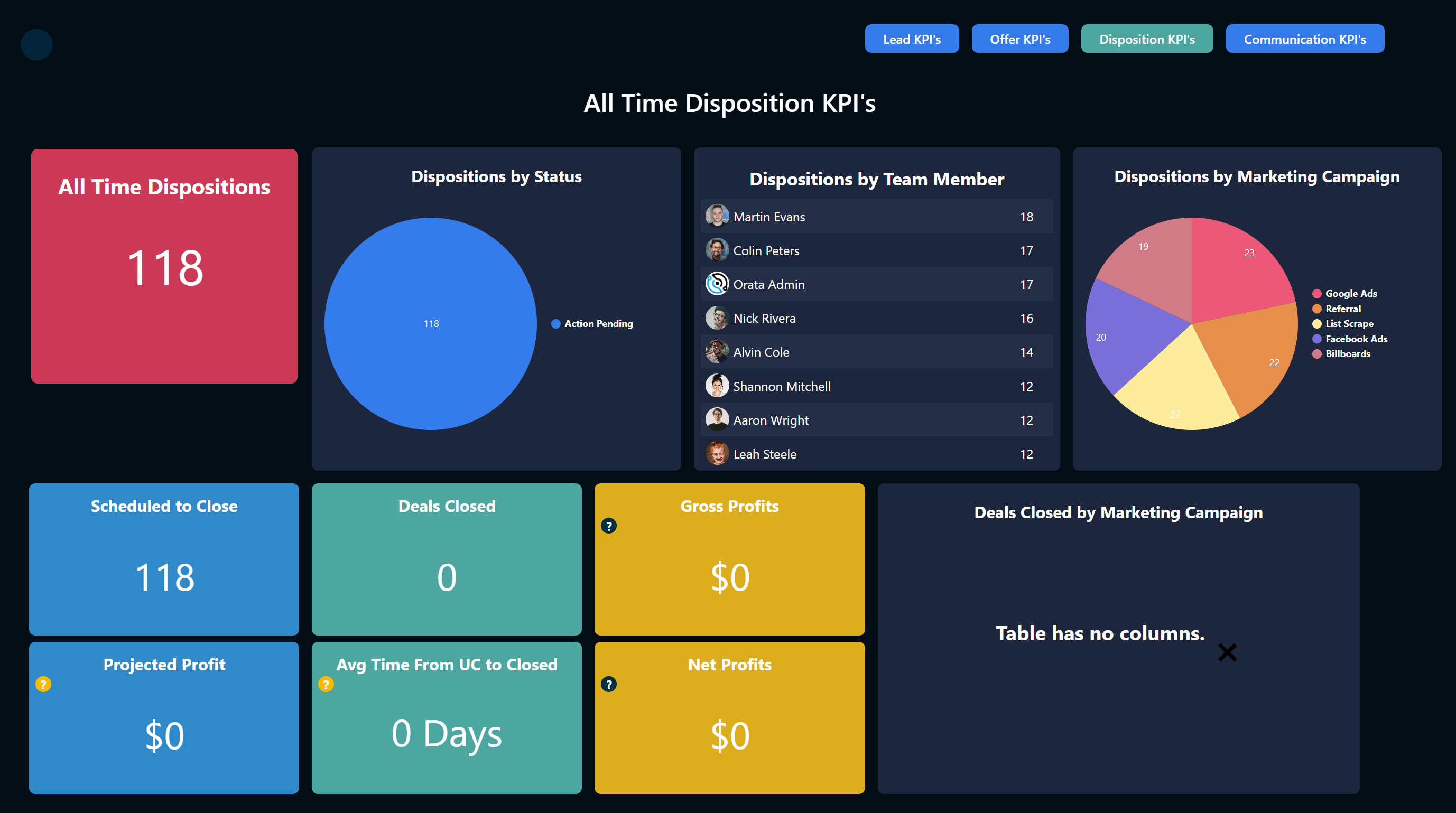
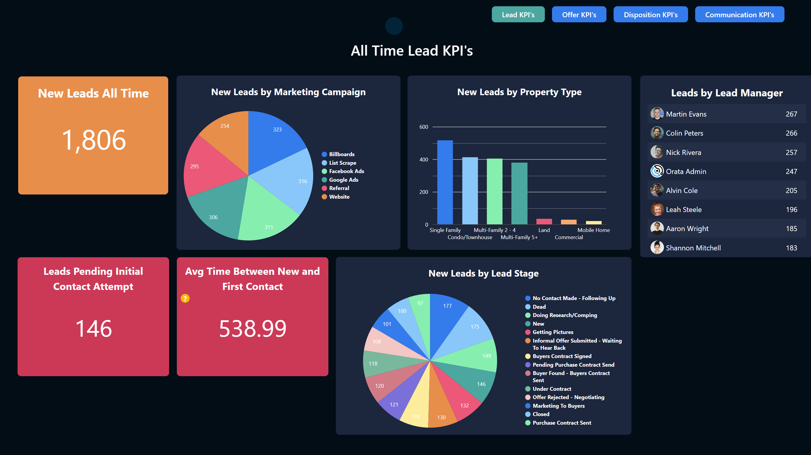
Below are some screenshots from a dashboard I created with Podio and Procfu. The data is just pulled from widgets and views with quite a bit of custom javascript to get the users pictures to show in the tables etc.
Just wanted to post this to give you an idea of the type of charts I use which are all pretty basic bar and pie charts:
that’s truly impressive! Really cool what you’ve built there. Especially when you compare it with the built in reports and charts from Podio.
One question, how do you integrate this into Podio? Probably with a link on the Workspace page or Home?
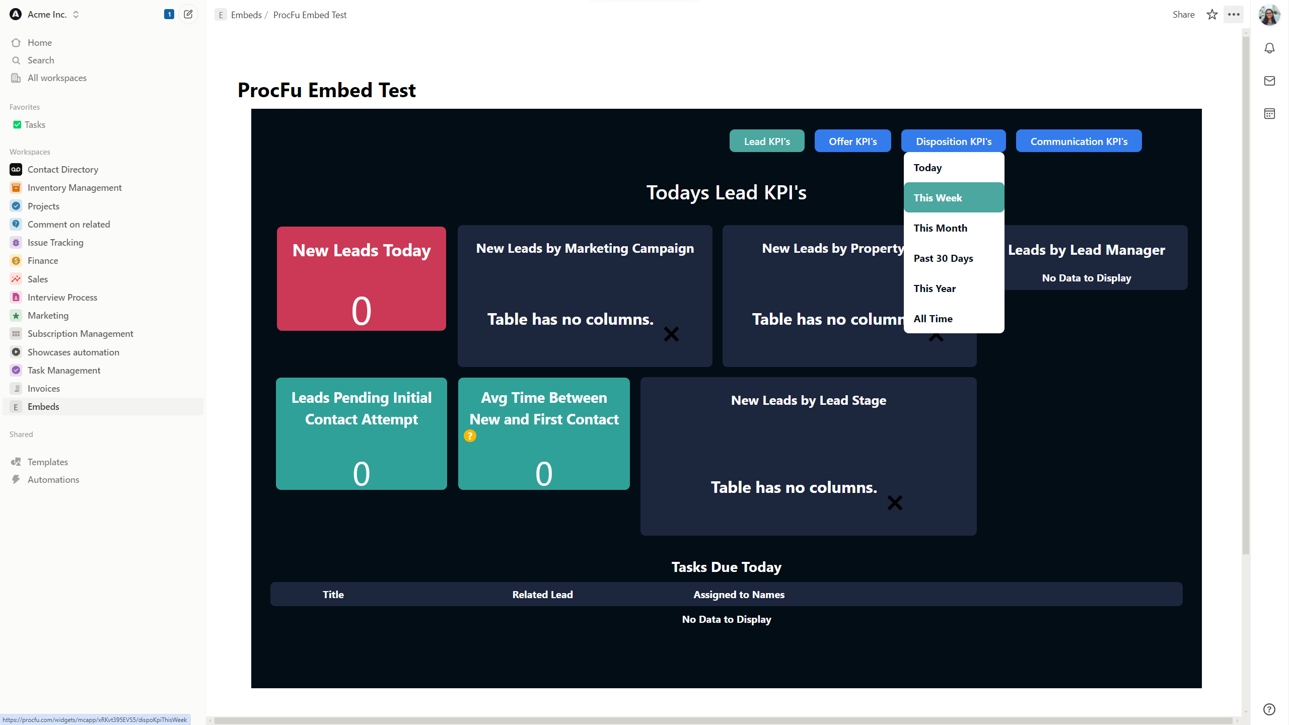
Yes it’s just an external link that ProcFu provides that can be put anywhere (usually I put it on the home page) so while it’s connected to Podio via ProcFu it’s not integrated into Podio
That sounds very exciting, one of our first blocks in the dashboard that is currently in beta is an embed block with which you can embed a lot of web content with an iframe including Google Looker Studio. I personally would be very interested to know if the current version works with ProcFu. Could you perhaps send me a link with the dummy data you posted here so that I can test it briefly? If not possible, no problem at all
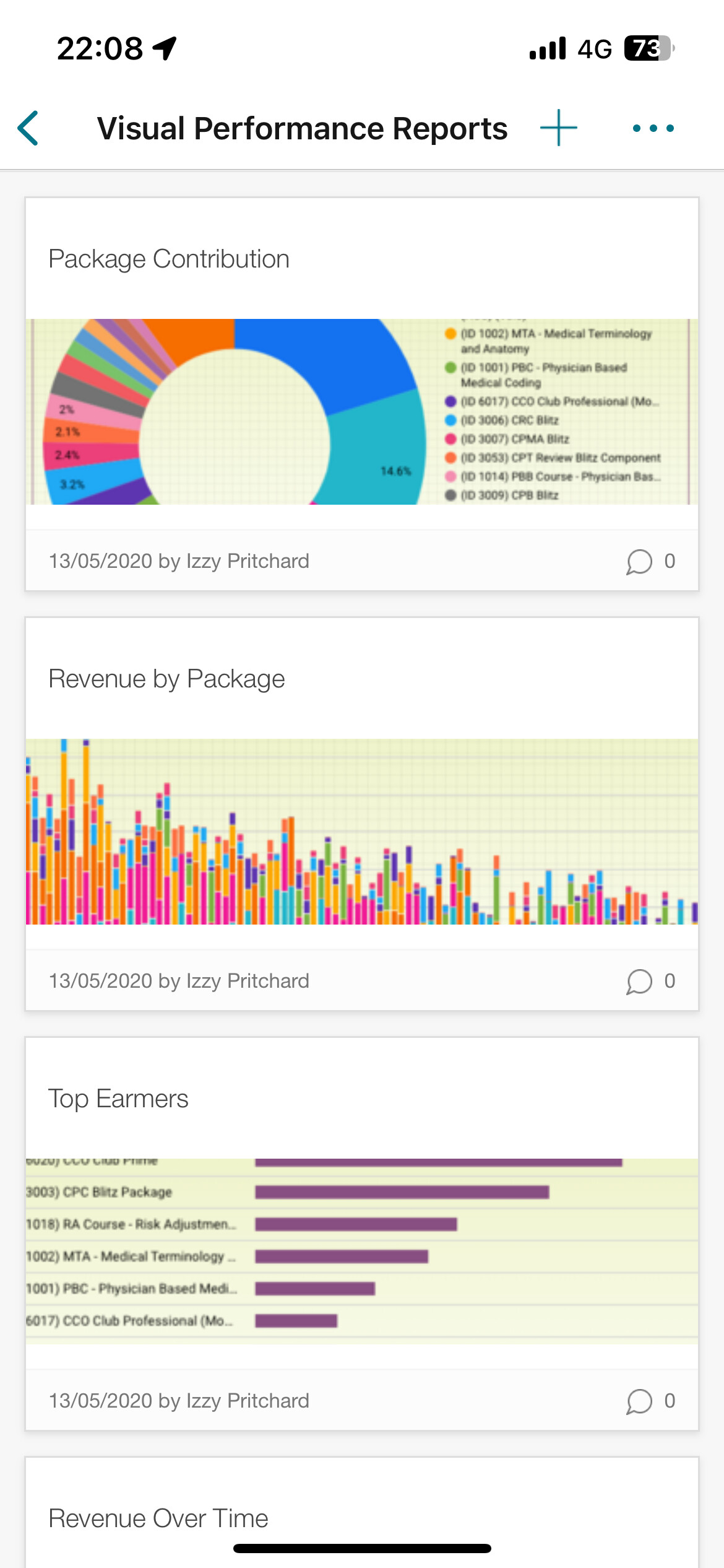
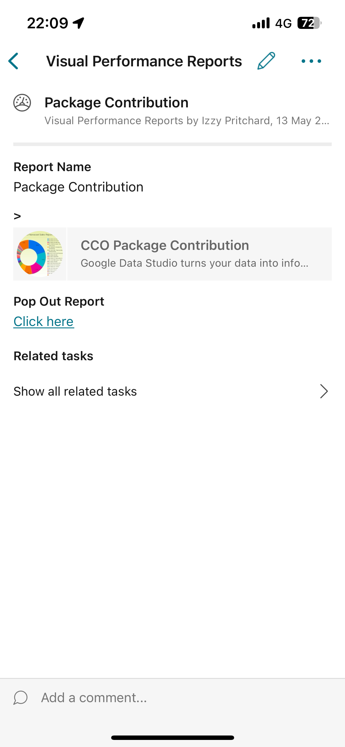
Hi chaps, at Future Solutions we use GDS (amongst other things) alongside Podio embedded in items which render on desktop (not as well on mobile as first 2 shots testify to, 3rd image is what shows in item on desktop but have cropped client name out from phone) but that includes the ability to change the report filters etc.