The chart blocks are a fantastic way to display an intuitive snapshot of information.
Now, we've added a new way to visualize your data.
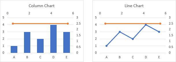
Introducing line charts in Tape 📈
That’s it — your first line chart is created. We hope you enjoy this creation process as much as we do.
From this point, you can customize your chart to match your needs.
Here are some highlights that make Tape line charts different, thanks to community feedback:
Comparisons: Add multiple data lines with subgroups, e.g., to compare budgets from last year.
Clear visualization: Instantly shows data proportions and details upon hovering.
Deep analytics option: Set group limits to show only, e.g., the last 3 months.
Real-time data: Display dashboards on TVs around the office.
Fast execution: Copy and paste reports, including the style.
See the underlying records by clicking on the report result.
Flexible Styling: Offers various design options.
Charts are included in Tape’s premium plan at no extra cost. Plus, during our beta, you can enjoy charts with any plan. Over time, you’ll see even more types, like list reports and more.
To get the most out of Tape reporting, it’s helpful to understand a few key foundational concepts. Compared to other tools, Tape has a unique and highly flexible drag-and-drop editor, where any reports can be easily rearranged and transformed. Read more → Tape Reports | Tape Help Center
For a head start, just click the link and duplicate the workspace to your organization → Tape’s dashboard app template
Enjoy telling your data’s story with Tape’s line charts!
And as always, we’re excited to hear your thoughts.
For me, this is the final piece of the massive dashboard challenge that you set yourselves and have worked so hard to deliver.
People no longer need to send data out to a different database just to be presented graphically.
The ability to display the data that people need to see in a manner that is appropriate for them and the data all within the tool that they should be spending most of their time (for fear of sounding a little AI) is game-changing!
You add to this that the data display can act as a versatile access point to the most important information and that you can pull information from multiple workspaces and applications with ease.
yes definitely! The line chart was the last chart for the moment. The list report and a few more blocks such as app links, web links or the group block will follow to complete the experience of building powerful and beautiful dashboards.
However, we are particularly proud of the sub-groups, which offer completely new analysis possibilities, such as a chronological trend over months and at the same time a yearly comparison in the same chart. Calculating this data quickly was a real challenge for our development team. But also the comparison function in the number chart with conditional fromating is a completely new way to analyze your data.
Thanks again for your great feedback! We are already looking forward to the dashboards and creative ideas from our community.